
PureVPN Password Manager
PureVPN Password Manager
PureVPN Password Manager
Solving low adoption by integrating password management into the core VPN experience.
Solving low adoption by integrating password management into the core VPN experience.

My role: Led end-to-end design for the integrated Password Manager within PureVPN, in collaboration with a PM and with support from the head of design. Conducted user interviews, competitor analysis, user-flow mapping, UX and UI design, prototyping, and usability testing.
My role: Led end-to-end design for the integrated Password Manager within PureVPN, in collaboration with a PM and with support from the head of design. Conducted user interviews, competitor analysis, user-flow mapping, UX and UI design, prototyping, and usability testing.
Impact: Improved activation from 42.4% to 51.4% by simplifying complex flows and seamlessly integrating the password manager into the core VPN experience. Enhanced user trust and reduced friction, transforming a low-adoption standalone tool into a more accessible, widely used feature.
Impact: Improved activation from 42.4% to 51.4% by simplifying complex flows and seamlessly integrating the password manager into the core VPN experience. Enhanced user trust and reduced friction, transforming a low-adoption standalone tool into a more accessible, widely used feature.
PureVPN, founded in 2007 and now trusted by over 3 million users with more than 6,500 servers worldwide, has always prioritized security and privacy. However, the password manager (“PureKeep”) as a standalone app has always seen a surprisingly low activation and user adoption — many users launched the app but never fully activated or used the feature.
PureVPN, founded in 2007 and now trusted by over 3 million users with more than 6,500 servers worldwide, has always prioritized security and privacy. However, the password manager (“PureKeep”) as a standalone app has always seen a surprisingly low activation and user adoption — many users launched the app but never fully activated or used the feature.
Given PureVPN’s security-first brand and existing user base, the question was clear: How could we move the needle on activation by integrating the password manager more seamlessly and reliably within the app users already trust?
Given PureVPN’s security-first brand and existing user base, the question was clear: How could we move the needle on activation by integrating the password manager more seamlessly and reliably within the app users already trust?
Diving into the problem
Diving into the problem
Diving into the problem
Before reaching out to real users, we wanted to first understand what was broken in the current experience and so, we began by conducting usability tests with five internal users.
The idea was simple: assign a few tasks, observe how they navigate through the product, and identify friction points in the design, flow, and overall UX. This helped us spot issues early, from confusing labels to unintuitive actions, and gave us a baseline for what needed to change before going broader.

Here were some high level problems identified:
Screens were cluttered with too many options, making it hard to focus on what really mattered.
Common actions like inviting a member to organization, exporting items, etc. were buried or hard to find, leading to frustration.
Labels like “vaults” and “organizations” created confusion instead of clarity.
There were no onboarding cues or tooltips to help users understand how to get started.
Certain features didn’t serve a clear purpose and only added to the complexity.
Designing early concepts
Designing early concepts
Designing early concepts
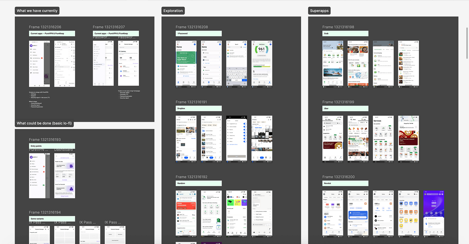
With the usability issues and user frustrations clearly mapped out, one of the biggest challenges that came along was how do we fit an entire standalone app in another app as a feature?
PureKeep, the previous app, relied heavily on side navigation with multiple standalone views. This structure simply wouldn’t work inside an existing product like PureVPN. We needed a seamless integration that felt native to VPN users, without overwhelming them with layers of navigation or settings.
To solve this, I looked at how superapps embed full-featured tools without disrupting the core experience and reviewed our competitors — including LastPass, Dashlane, NordPass, and Dropbox Passwords — to understand how they simplify mobile flows.
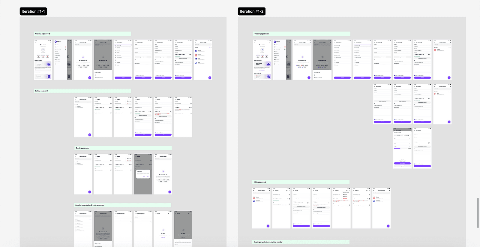
Keeping all that in mind, I started designing the first iteration and prototypes of an integrated experience. These prototypes focused on stripping away the clutter, simplifying navigation, and making everyday actions — like saving, editing, or autofilling passwords — feel smooth and effortless.
Since we have more users on Android, we started there focusing only on the core tasks flows and treating it as our foundation before scaling to other platforms.
Identifying key user insights
Identifying key user insights
Identifying key user insights
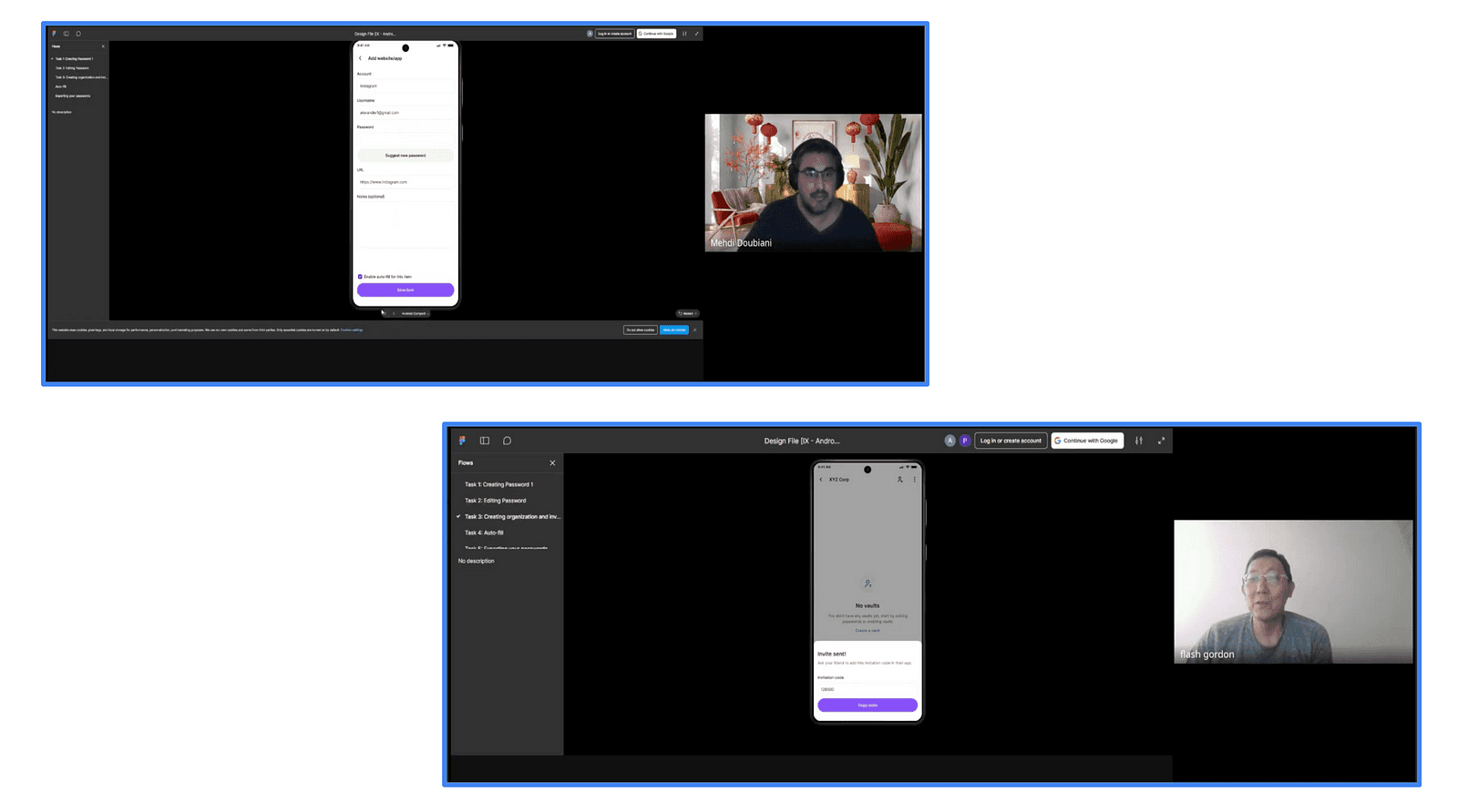
We conducted a total of 15 interviews and went through 3 major design iterations. Each session gave us valuable feedback that helped shape the product and make the experience simpler and more intuitive.
These sessions were not just to evaluate the prototype, but to understand how people think about password managers more broadly and what their experience has been with other password managers.
A few clear themes emerged from these conversations: users take passwords and security very seriously, trust is fragile and hard to rebuild, everything needs to feel effortless and quick, familiarity drives adoption, and must-have features like biometric login and strong auto-fill are non-negotiable.
A few users mentioned: “For me, security isn’t just about locking things down. It’s about knowing my data is actually safe without making my life harder. If I don’t feel confident about where my passwords are stored, I’d rather not use the tool at all.”
And then one users also mentioned examples from Apple & Google: “Google and Apple have nailed it because everything feels like one system. I don’t have to figure out new menus or learn weird terms. It auto-fills, syncs everywhere, and I barely even notice it’s there — that’s what makes me trust it.”
In addition to these themes, we also started identifying some patterns that appear while users were testing the prototypes. For example, in the first version, users struggled with unclear terms, hidden actions, and an overall heavy flow. By iteration three, we had refined the interface to be cleaner and more guided — simplifying language, surfacing key actions like editing and generating passwords, and making the overall journey feel smoother and more familiar.
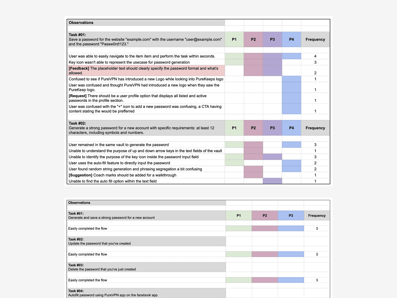
Comparison of user testing patterns from first iteration (top) to third (bottom), showing detailed usability issues in the first version and smoother task completions in the improved final version.
Comparison of user testing patterns from first iteration (top) to third (bottom), showing detailed usability issues in the first version and smoother task completions in the improved final version.
Designing the final solution
Designing the final solution
Designing the final solution
After three rounds of feedback and continuous refinement, we arrived at a final solution that truly balanced security, simplicity, and familiarity. In this last iteration, we focused on making every interaction feel intuitive and effortless — from creating and editing passwords to auto-filling them across devices.
Below are the core flows and final design screens that bring this new experience to life:
Setting up password manager: We designed the setup flow to be quick and approachable, even for first-time users. The flow focuses on creating a strong master password with clear guidance on strength and security.
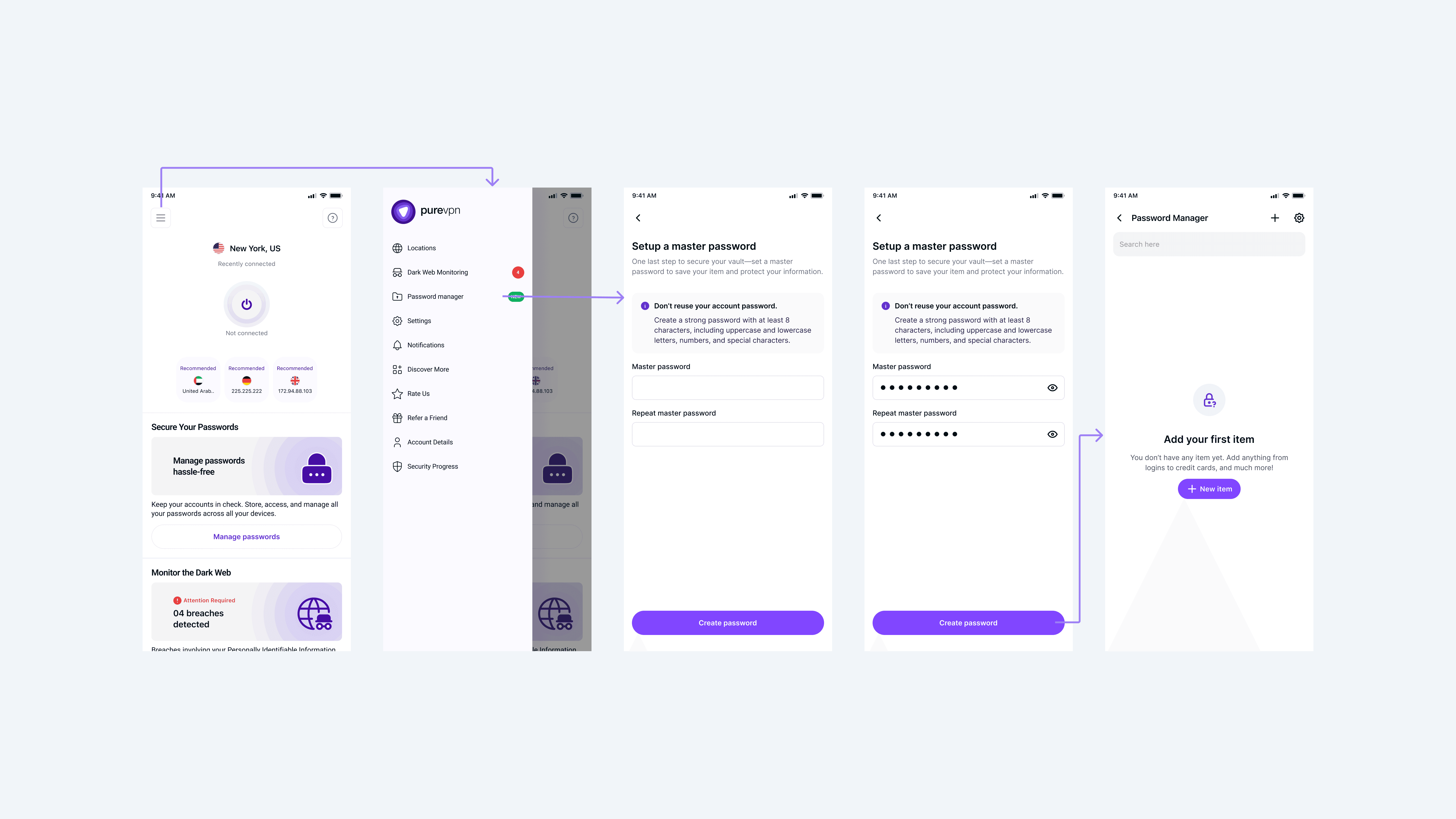
Adding the first item: In this flow, we prioritized clarity and made each step straightforward. For the initial releases, the password generator (which was previously a standalone feature in PureKeep) was integrated directly into this flow. This allowed users to create strong, custom passwords without needing to leave or switch contexts.
Adding the first item: In this flow, we prioritized clarity and made each step straightforward. For the initial releases, the password generator (which was previously a standalone feature in PureKeep) was integrated directly into this flow. This allowed users to create strong, custom passwords without needing to leave or switch contexts.

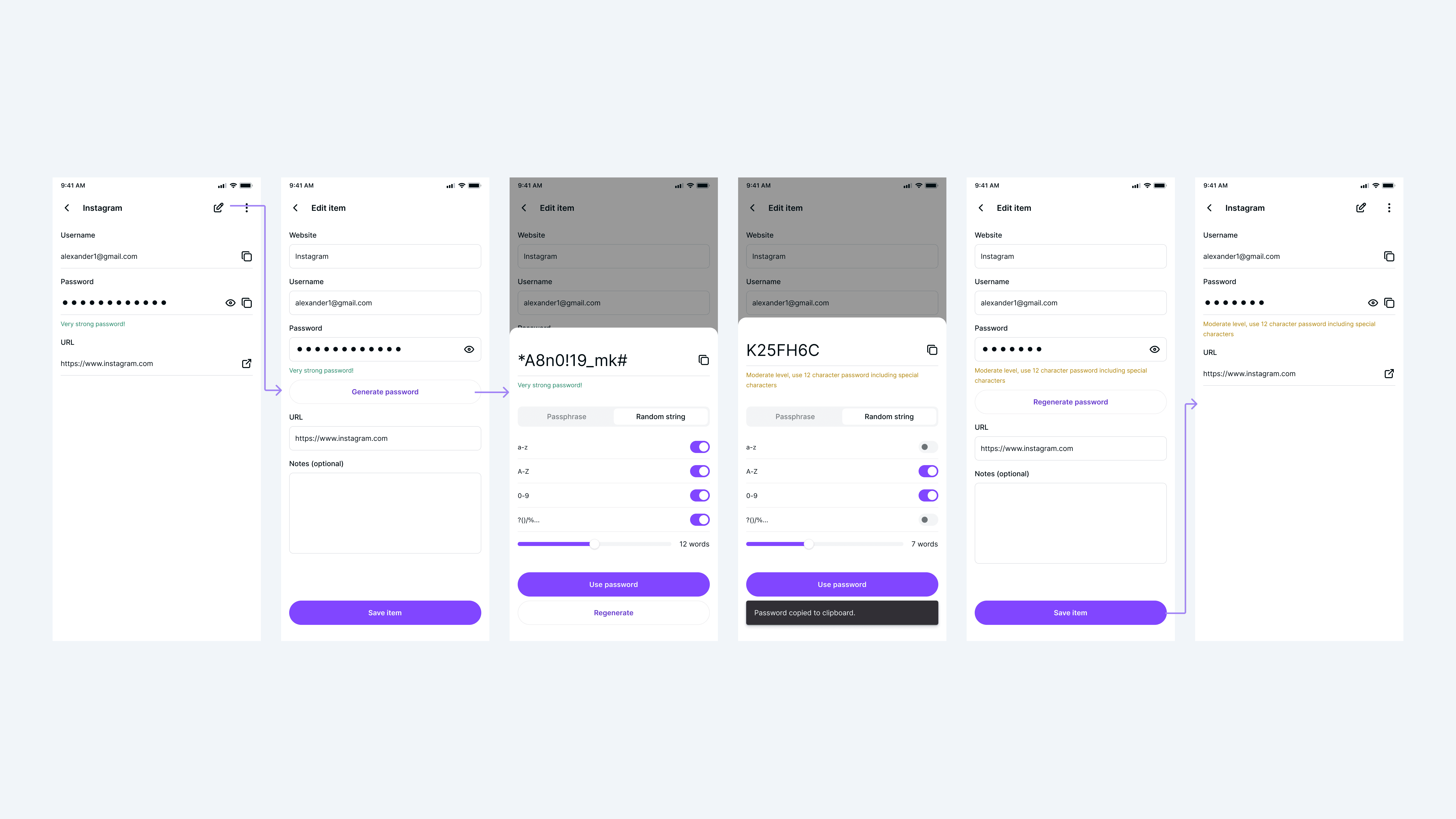
Editing password via password generator: Updating passwords became a smoother experience with integrated feedback mechanisms. We provided real-time strength indicators and suggestions while generating or updating passwords. Additionally, we introduced snackbars and subtle confirmations to let users know when actions were successful — something missing from PureKeep. This added layer of feedback helped build confidence and reduced uncertainty during critical security tasks.
Editing password via password generator: Updating passwords became a smoother experience with integrated feedback mechanisms. We provided real-time strength indicators and suggestions while generating or updating passwords. Additionally, we introduced snackbars and subtle confirmations to let users know when actions were successful — something missing from PureKeep. This added layer of feedback helped build confidence and reduced uncertainty during critical security tasks.
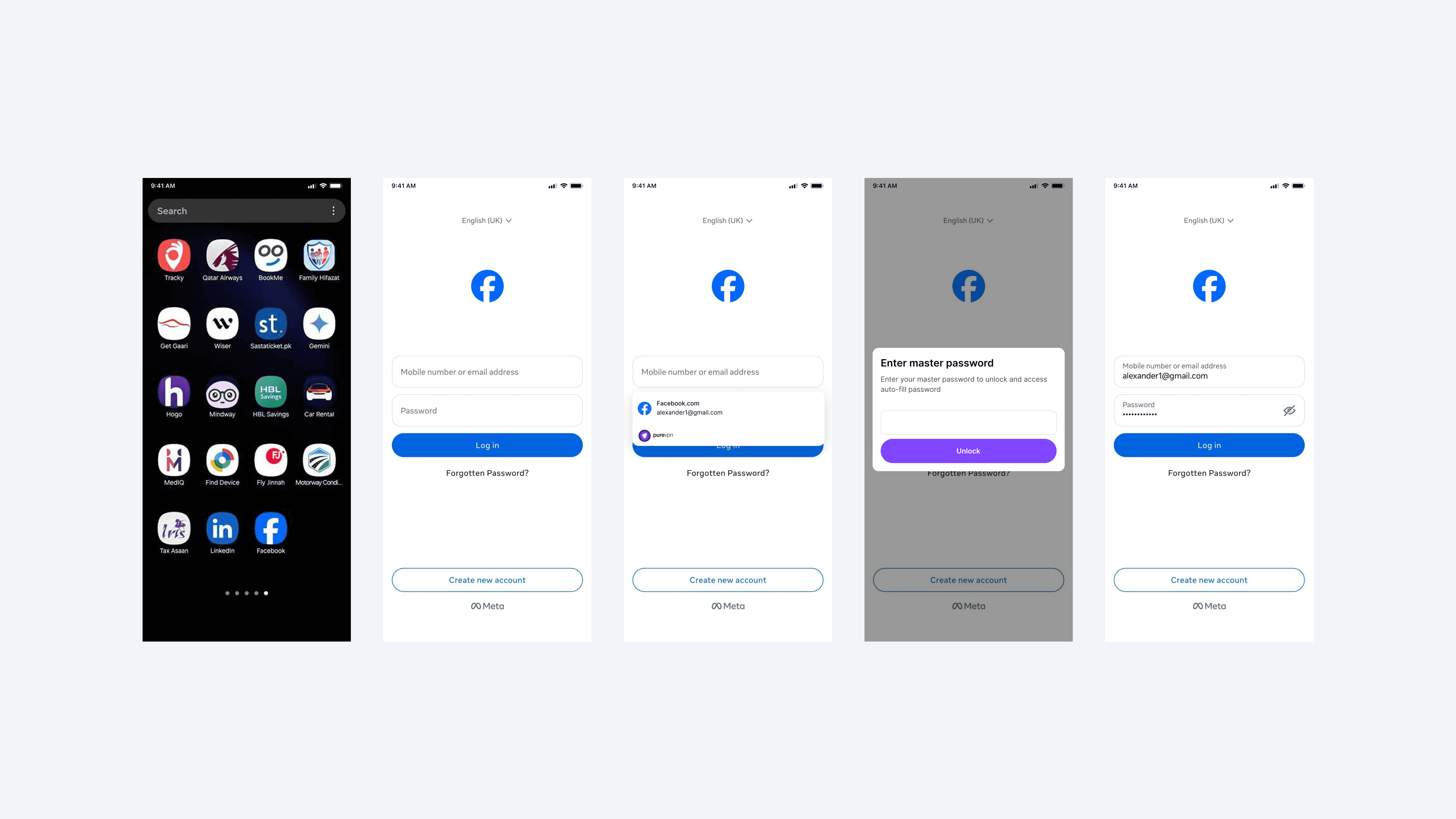
Logging in via auto-fill: Auto-fill was fine-tuned to work seamlessly across apps and browsers. Keeping Apple and Google feedback in mind, we made sure that login credentials appeared exactly when needed, minimizing extra steps or confusion. This flow was designed to feel fast, secure, and invisible allowing users to focus on their tasks rather than worry about searching for saved passwords.
Logging in via auto-fill: Auto-fill was fine-tuned to work seamlessly across apps and browsers. Keeping Apple and Google feedback in mind, we made sure that login credentials appeared exactly when needed, minimizing extra steps or confusion. This flow was designed to feel fast, secure, and invisible allowing users to focus on their tasks rather than worry about searching for saved passwords.
Settings: Since this experience was now integrated into PureVPN rather than a standalone app, it was important to take a holistic approach. We combined password manager settings with PureVPN’s app settings to create a unified, cohesive experience. This approach not only simplified the overall experience but also reinforced the sense that the password manager is part of a larger, trusted ecosystem rather than a separate product.
Settings: Since this experience was now integrated into PureVPN rather than a standalone app, it was important to take a holistic approach. We combined password manager settings with PureVPN’s app settings to create a unified, cohesive experience. This approach not only simplified the overall experience but also reinforced the sense that the password manager is part of a larger, trusted ecosystem rather than a separate product.

The results
The results
The results
Within just three months of launching the integrated password manager, we saw a remarkable boost in user engagement and activation.
Within just three months of launching the integrated password manager, we saw a remarkable boost in user engagement and activation.

Before the redesign, the funnel showed significant drop-offs at each stage. Out of 3,186 app launches, only 42.4% of users reached login, and just 18.6% (251 users) completed adding an item in the password manager. These numbers clearly highlighted friction in the flow, confusing terminology, and a lack of trust or motivation to activate the feature.
After the redesign, we saw a dramatic improvement. With the new simplified setup, clearer language, and stronger feedback mechanisms, activation rates rose to 20.8% — meaning 170 successful activations out of 1,587 launches. While the raw numbers were smaller due to controlled rollout, the percentage uplift is clear. The login step completion also improved to 51.4%, indicating that users were more willing to continue beyond the initial screens and explore the password manager.

By prioritizing simplicity, familiarity, and trust, we transformed the password manager from an underused feature into a core tool that users genuinely adopted and relied on.
By prioritizing simplicity, familiarity, and trust, we transformed the password manager from an underused feature into a core tool that users genuinely adopted and relied on.